
Your Color Story
Selecting a Palette for Your Vintage Art Journal

Color is more than just paint on a page—it’s emotion, memory, and storytelling wrapped into one. When creating a vintage art journal, the colors you choose become an extension of your creative voice. They set the mood, evoke nostalgia, and guide the visual rhythm of your pages. But where do you begin? Should you embrace the soft elegance of a monochrome palette, the harmony of a limited selection, or the exuberance of all the colors?
Let’s explore the magic of each approach and how it can shape your journal’s unique color story.
Monochrome Magic: One Color, Infinite Possibilities
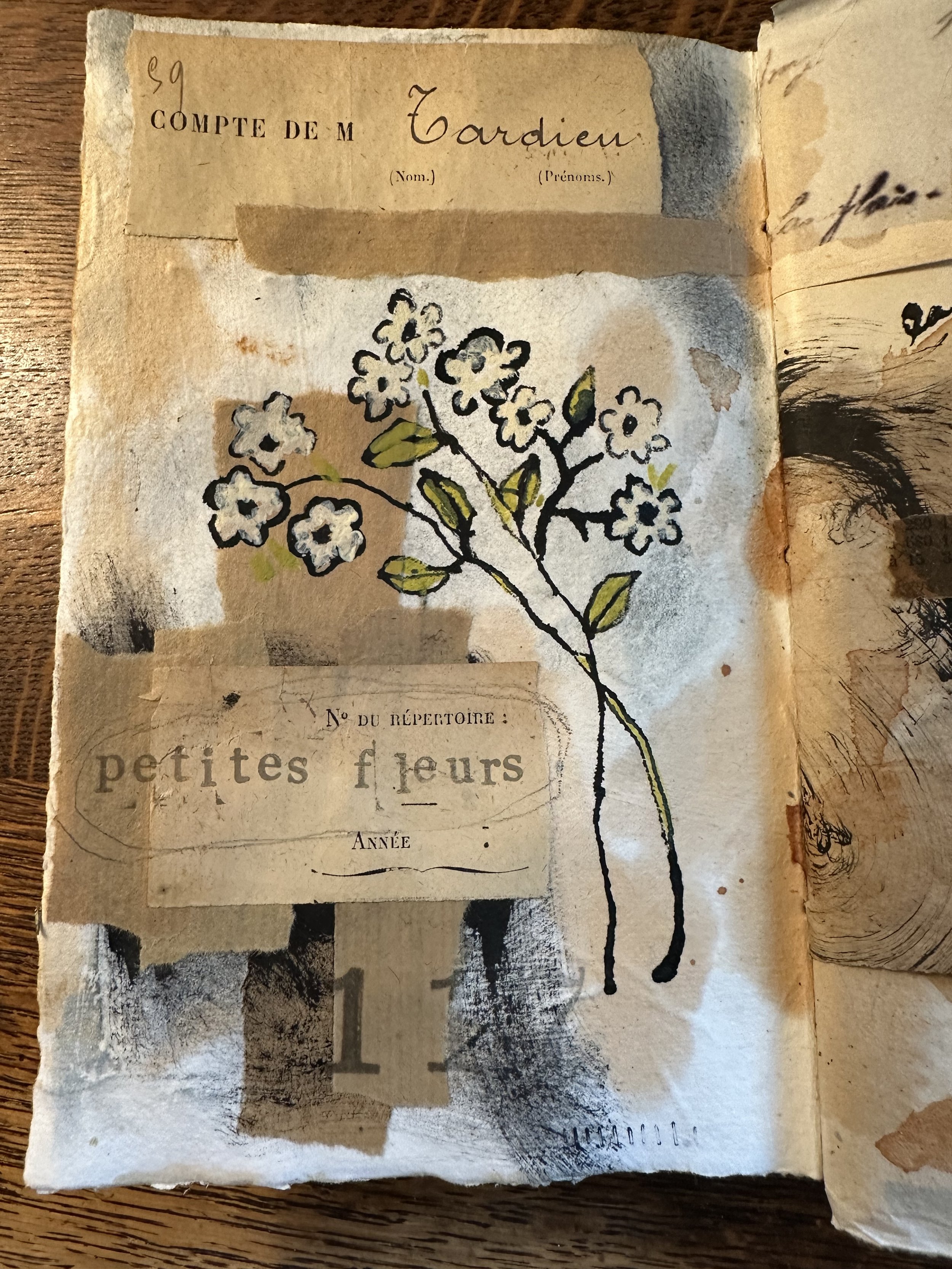
A monochrome palette—working with shades, tints, and tones of a single color—can create a sense of depth, cohesion, and vintage charm. Think of sepia-toned photographs, aged book pages, or the dreamy hues of old postcards. This approach is perfect if you want your journal to feel serene, poetic, and timeless.
Ideas to try:
Experiment with variations of one color using different materials—watercolor washes, ink, or colored pencil.
Incorporate vintage papers that naturally complement your chosen hue.
Introduce contrast through texture rather than color—lace, fabric scraps, and layered paper elements.
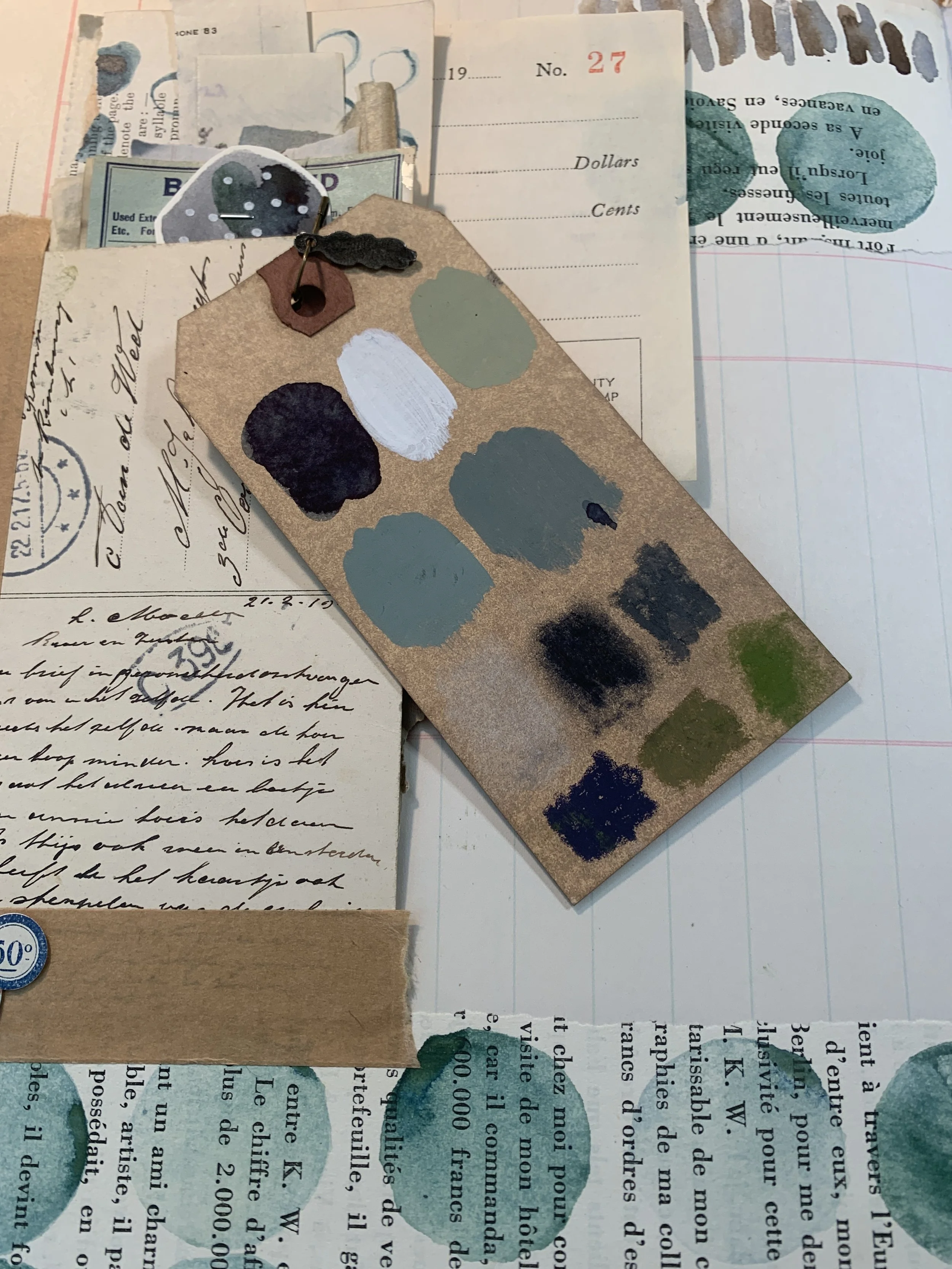
The Limited Palette: A Harmony of Hues
A limited palette—choosing two or three complementary colors—offers the best of both worlds. It keeps your journal visually unified while allowing for contrast and interest. Think of weathered blues and soft creams for a French antique aesthetic or deep rust and ochre for a rich, timeworn feel.
Ideas to try:
Select colors inspired by vintage ephemera, like old botanical prints or aged wallpaper.
Play with muted or desaturated versions of your chosen colors for a naturally vintage look.
Use a pop of a third accent color sparingly to create focal points.

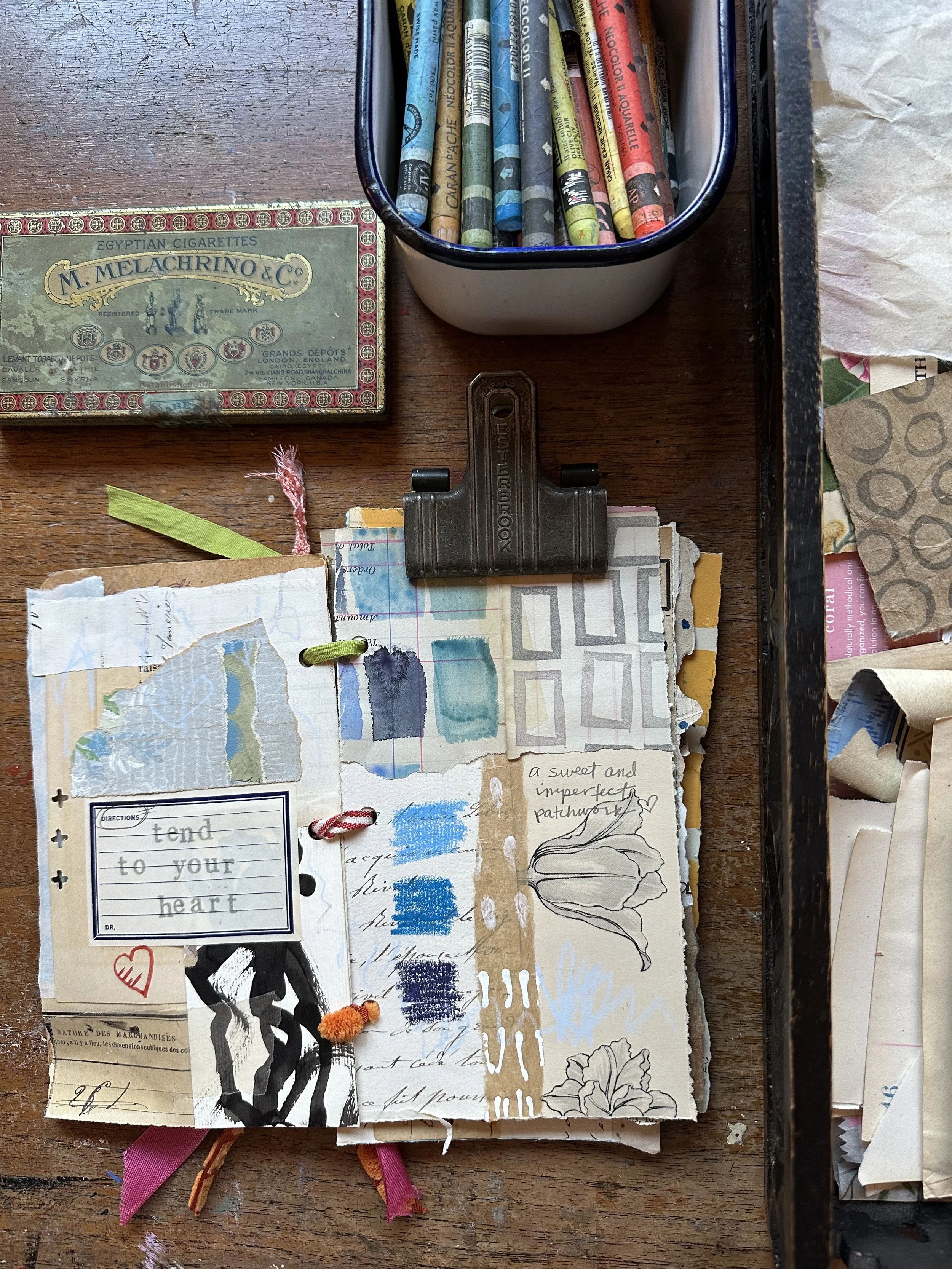
All the Colors!: A Vibrant Story Unfolds
Why limit yourself when you can embrace the full spectrum? An eclectic, colorful palette can be playful and dynamic, like flipping through a well-loved scrapbook or a tattered quilt made from many hands and histories. This approach is for the artist who thrives on spontaneity and layers of unexpected joy.
Ideas to try:
Let found materials guide your choices—tickets, postage stamps, and vintage illustrations are naturally colorful.
Create contrast between bright and muted colors for depth and intrigue.
Use color freely but with intention—maybe one page explodes with color while another offers a quieter moment.
Finding Your Color Story
No matter which approach speaks to you, trust your instincts. Your vintage art journal is a space for storytelling, exploration, and discovery. Pay attention to what colors light you up, what feels nostalgic, and what makes your heart race a little faster. Let your color story unfold organically, page by page.
What colors are calling to you today? Drop a comment below.